I chose to create a newsletter about food. More specifically about
small things everyone can do to improve the way we eat.
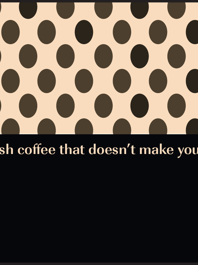
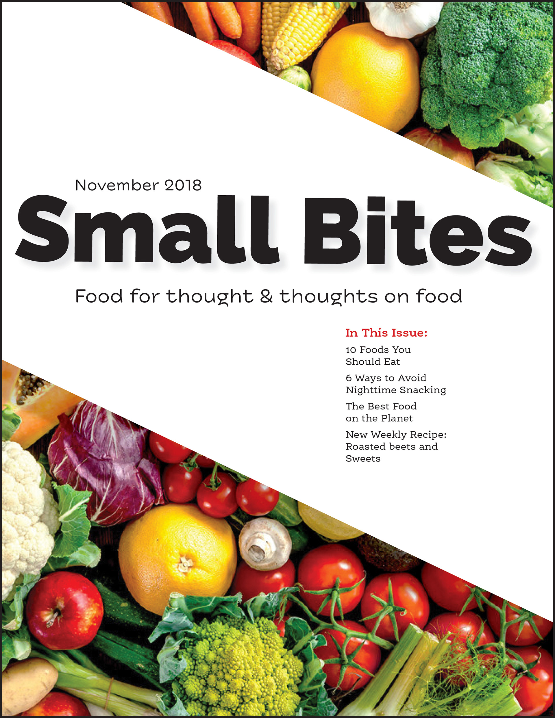
I used contemporary rounded fonts to create an inviting and natural feel, while maintaining a level of authority. The two column layout of information creates a ease of readability. I stretched the initial information across the page to draw the reader in and give prevalence to lead article.
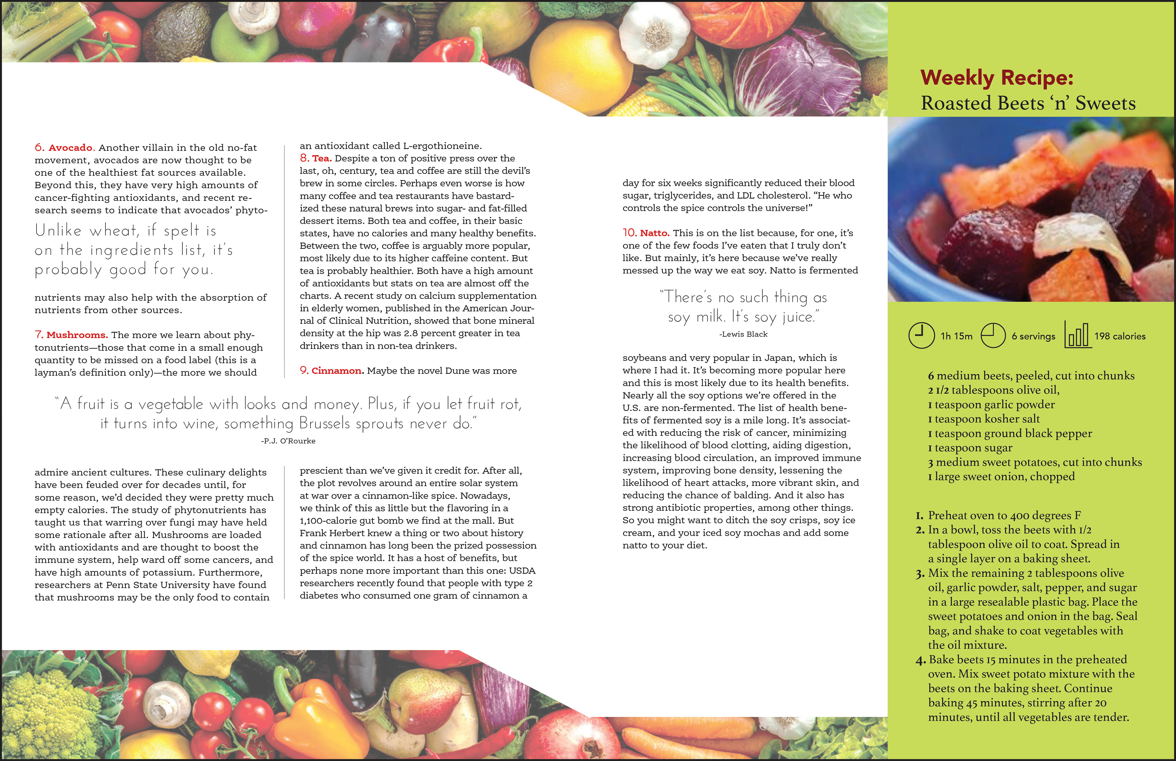
I incorporated callous and pull quotes to break up the informational and make it more easily read. I created a sidebar containing a recipe. To ensure that this section stood on its own I used a difference in background color and a change in font choice. I used infographic to express information more quickly and effectively.
For the second article I chose a different font with a different treatment to differentiate its importance from the lead article. I kept the two column layout to unify the newsletter and used colorful enticing imagery.
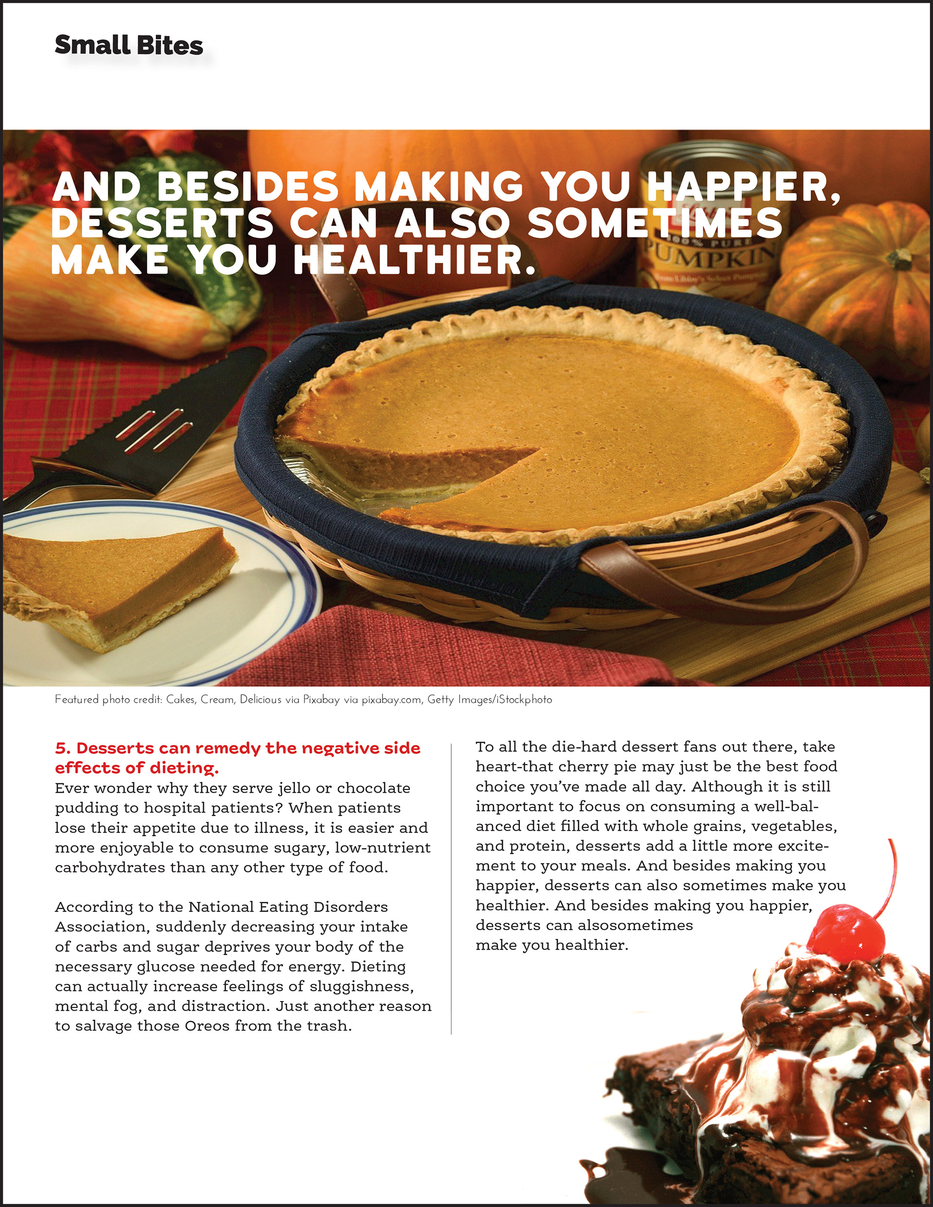
Closing the newsletter I allowed for there to be some white space on the bottom of the page so that the viewers eye doesn't end reading abruptly.